Ask most packaging buyers what separates foil stamping from metallic ink, and you’ll get a variation of the same answer: “One is shinier.” That‘s technically true, but it misses the point entirely. The difference isn’t about shine. It‘s about how each finish behaves on paper, how long it lasts, and what it communicates when someone picks up the box.
Here’s what you actually need to know.
The Layer Thickness Gap
Metallic ink is pigment suspended in a varnish carrier. When printed, the particles align on the surface and reflect light directionally. The ink layer measures roughly **2–3 microns** thick. It sits on top of the paper and stays vulnerable to abrasion. Run your finger across a metallic-printed surface a few dozen times, and the shimmer starts to dull. The reflective particles scatter or wear off, leaving a flat, grayish cast behind.
Foil stamping transfers a solid film — typically **10–15 microns** thick — onto the substrate. That‘s five to seven times thicker than metallic ink. The metal layer is continuous, not particulate. It reflects light evenly, and because it’s bonded through heat-activated adhesive, it holds up to handling.
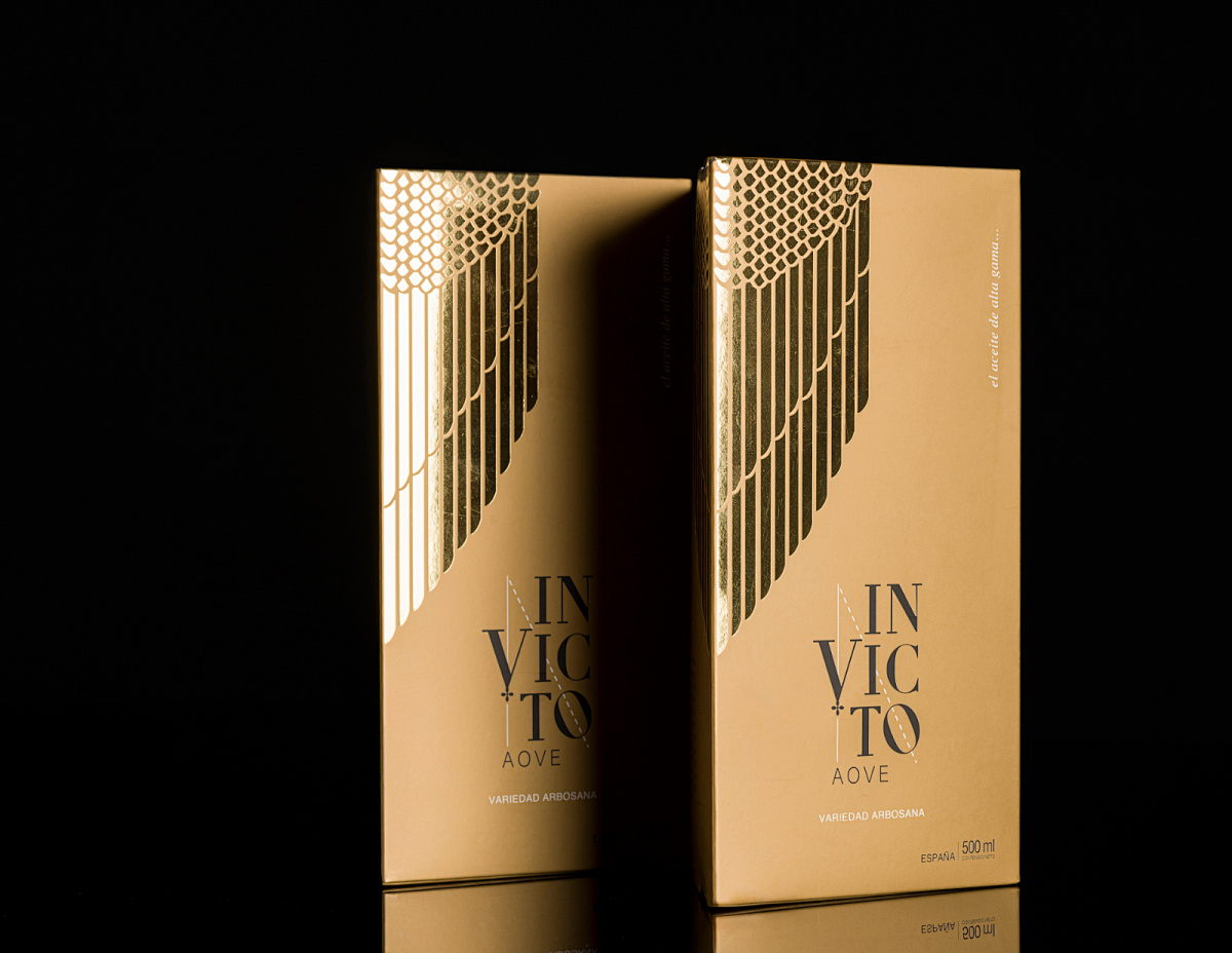
Edge Definition and Opacity
Metallic ink spreads slightly on porous paper. The edges soften. Under magnification, the boundary between printed and unprinted areas looks fuzzy. Foil stamping produces a clean, sharp edge because the die cuts through the foil layers cleanly.
Opacity is another differentiator. Metallic ink is semi-transparent. The paper color underneath affects the final shade. That metallic gold you approved on white board will look different on kraft or recycled stock. Foil is fully opaque. What you see on the sample is what you get on any substrate.
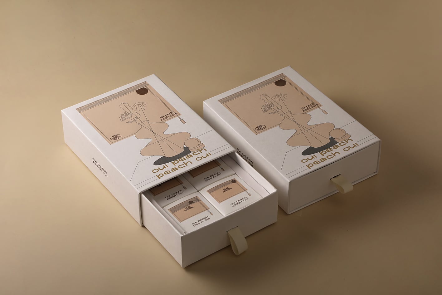
The Texture Problem
Metallic ink requires a smooth surface. On textured or embossed paper, the ink can‘t reach the valleys of the texture. The high points get coverage; the low points don’t.
Foil stamping, with its heated die and applied pressure, conforms to the surface. It transfers into the low areas as well. If your packaging uses textured stock — and a growing number of premium brands are moving in that direction — foil stamping is the only reliable way to get metallic coverage across the entire surface.
When to Choose Which
Foil stamping delivers bold impact, high reflectivity, and a tactile luxury that metallic ink cannot replicate. It‘s the right choice for logos, brand marks, and any element that needs to command attention.
Metallic ink offers a more subtle shimmer. It’s more economical for volume runs and works well for supporting design elements — background patterns, decorative borders, or secondary text that doesn‘t need to dominate.
Many premium brands use both: foil stamping for the hero elements, metallic ink for the supporting cast. The combination creates depth and texture without blowing the budget.
What This Means for Your Project
If you’re specifying a finish and the design calls for metallic effect, start by asking: where is this package going to be handled, and how many times? Shelf products get picked up, put down, and picked up again. If the metallic element is part of the brand identity — a logo, a monogram, a key visual — foil stamping is the durable choice. If it‘s decorative and secondary, metallic ink may be sufficient.
And if your paper has texture, foil stamping isn’t optional. It‘s the only option that works.
 EN
EN


